Showing posts with label Visual Development. Show all posts

Monday, 23 April 2018

Animation Production Diary - Let there be light


Scene Twenty-Seven pencil test without and with background.

Sometimes I think I don't like myself. A short walk cycle? Okay. Turning on a light switch? Okay. All from a birds-eye view? Sheesh. Capturing the angle was very challenging, the original pencils were close but felt slightly off so I needed to transform the frames digitally with skew and perspective. 
But it felt right, having a distance at the end, we have observed and we must not forget that we are observers of an autonomous life. The Melancholic Wife is in her power, she does not need us. 
I asked Sadhbh to make two versions of the background, one with the light turned on, one without. There is a prop to be added as well, a notebook and pen that sit on the table. A gentle zoom into the Melancholic Wife and the notebook will be added in tandem with a fade up to white. Also shadows, I do think I have something against myself!


Scene Twenty-Seven digital inks without and with background.


Thursday, 19 April 2018

Animation Production Diary - Dancing Queen


Scene Twenty pencil test and digital ink. My first attempted use of motion blur effect on the Melancholic Wife's arms.


Scene Twenty-One pencil test and digital ink. A cycle of eleven drawings shot on threes.


Tuesday, 17 April 2018

Animation Production Diary - Of magic dust and doors

Having reached apotheosis through a conquering of the dark the Melancholic Wife is ready to return to the 'unromantic walls of her real life'. But first she'll need a doorway and one dutifully manifests from the dissipating energies of her embracing and dancing with the light. The main task of these two scenes was an exercise in special effects animation. The light effects that create the door and the few small sparkles that enter through it in the following scene were all animated directly in Photoshop, no pencilling involved this time. The animation of the door itself appearing will be done using masks in After Effects as will the animation of the door opening, using the corner pin tool.


Scene Twenty-Three digital inks.


Scene Twenty-Four digital inks and pencil shaded background.

The rendering of the background of Scene Twenty-Four was created by Sadhbh Lawlor over an A3 printed copy of the original inks. Sadhbh has a very strong ability in achieving tonal depth with pencilling and I wanted to pursue this style to create a strong contrast with the simple backgrounds of the dream space. The shading also mirrors the shading of the claws which grab the Melancholic Wife, indicating that though they are imagined, they draw their strength from real experiences.


Wednesday, 11 April 2018

Animation Production Diary - Grace and Poise

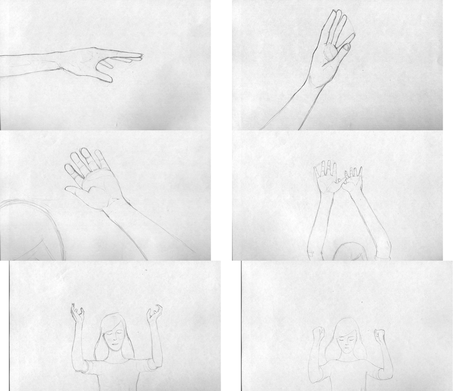
The Melancholic Wife has drawn the white light to herself with the aid of her ghost and now comes the first moment of exploration and play. She perceives the boundaries of her form in a new way, we see her twisting her hand, feeling the glow that surrounds her and its flow through the space she inhabits. We follow the arc of her rising hand until it meets its twin. There the gathering energy pushes them apart and she has to find the determination to control the power within her.


Pencil test.

Final inks.

This scene was heavily influenced by the desire to capture graceful balletic movement, and in part inspired by early reference like the short film Ballet Rotoscope by Masahiko Sato and Euphrates.


Tuesday, 10 April 2018

Professional Development - Skills Audit and SWOT Analysis


The Skills Audit and SWOT (Strengths, Weaknesses, Opportunities, Threats) Analysis represented another opportunity to utilise the visual identity elements created for the logo and business card. Fot the Skills Audit I decided on going with the pencil motif as a straight comparison to a bar graph. For me it also evokes that sense of pencils falling out of a box. I broke the audit down onto technical / software skills and soft skills gleaned and developed through my years of different creative employment. For the skills that defy a rating scale I included them at the bottom as scribbles to help convey the sometimes informal nature of these elements.

For the SWOT I thought of the pen motif and the line coming off as branches into each element of the analysis, vibrant green for strengths, brown for weaknesses, buds for opportunities and thorns for threats. What became clear is that my experience is a tremendous asset to me in terms of creative confidence but that my lack of particular experience in the animation field will be something to stay aware of, especially around technical know how considerations.

Monday, 9 April 2018

Animation Production Diary - Slow it down Scene Eighteen

Scene Eighteen represents something of a breath. There are a sequence of cuts before it between short scenes communicating lots of information and the scenes after it rise up again towards the crescendo of the final dance. So it's a chance to breath, take a metaphorical pause and have a slow moment to contrast with the quick. The Melancholic Wife's arms raise steadily, opening up to her power, opening up to the audience.

Pencil test alongside digital inks.


Animation placed in background. Further animation on the background including the spotlight drawing in, focusing on MW and emanating in a glow around her and a ghost clip will be added in compositing.


Thursday, 5 April 2018

Professional Development - Business Card


The finalised designs for the front and back of my business card. The front is my logo without the font elements communicating something of my personality. the back holds the information matter and I decided to go for a very strong graphic approach as a contrast to the illustrative dominance of the front. This is an attempt to convey something of the breadth of my experience. I also felt strongly about including the drawing utensils of pen and pencils in some way to give a nod to the fact that I still use these tools as part of my process on a daily basis.


Sunday, 1 April 2018

Animation Production Diary - Short but nevertheless important

There are a few scenes dotted through the animatic that could be described as very short and scenes five and six would fall under that category, comprising a total of three seconds all together. Scene five is a simple step into the 'ghost room' and scene six follows it up with a short glance up from our protagonist as she spots the ghosts.

While short they are important, scene six bridges the story from the frantic run that preceded it to the more serene atmosphere of the 'ghost room'. I felt it important to have her step even once, rather than just have a more easily completed hold, to represent the dissipation of energy from the mad dash.


One small step for the Melancholic Wife...


The glance upwards then has to communicate an emotional shift, I wanted to portray a graceful arc to her movement and emphasise the flow of her hair to preface the floating light tone of the dancing ghosts who are about to appear on screen. I learned the importance here of not underestimating any scene no matter the length and its potential to keep a story continuum on track.


This scene is also the first and only real close-up of the character so I really wanted to communicate her poise and character as much as possible.


Professional Development Logos


The final version of my designed logo, trying to communicate on both a strong graphic front with the block colour pen and an illustrative front with the line-work portrait. The integration of pen and portrait came from research into Saul Bass design and his imaginative and clear use of graphic elements interacting with one another in unusual ways.

Tuesday, 13 March 2018

Personal Brand Identity Development


Further development of the business card focusing on the strength of the illustration image on its own with the underlying grid of rectangular shapes speaking to my work in comic books and delivering colour information.


Possible logo and letterhead designs, I hand lettered the typography based on a font from the IM Fell Types class of fonts.

Tuesday, 6 March 2018

Business Card Concepts

I have been working up some different concepts for my business card.


This is my previous card and I like the duality element conveyed by the mirrored faces, it illustrates for me the different roles that I can inhabit as an artist. So I would like to retain some element of this while bringing in an indicator of the new reality of pursuing animation roles. The image gives a sense of my style as an illustrator but does not indicate an idea of animation. 

When talking to John Sherwin he recommended exploring the use of colour, hand lettering and emphasising the style that my work contains.

Here are a few samples.


Friday, 2 March 2018

Artistic Influences - Paul Pope

Another artist who has been an influence on the direction of my work is the Paul Pope, an American comic artist. I love his use of line weight in brush work to convey movement, tone and emotion. His work has an inherent kinetic energy.


Thursday, 1 March 2018

Animation Production Diary - How does your carpet grow?

Early on I identified for myself that Scene Two could be a quick gain in terms of production. It contained some tricky transitions too which would be good to solve early. One of those transitions is the growing of a carpet from a full black screen. I had the idea to create one instance of a carpet fibre growth then multiply it to produce a full floor.

 First Test

 Second Test - More fibres

Third test - ready to be multiplied in after effects.

Sunday, 25 February 2018

Background inspiration

One of my favourite production design styles was employed on the Disney feature 101 Dalmatians. I really admire the sketchy line work that they used and the blocks of colour overlapping the outlines of objects. For me it contributed hugely to the sense of energy in the film and I hope that my backgrounds can be as effective in communicating, in this instance, a sense of otherworldliness to high energy to calm.


Friday, 23 February 2018

Backgrounds

My film will be employing a black and white aesthetic in keeping with the comic art from the original story. In producing the backgrounds I also wanted to hold to the rendering style of the comic books. To that end I drew the backgrounds in pencil and inked them using the same techniques and tools as I used on the comic book. I see this as the base layer which may or may not require further working up. This depends on how the background will play with the animation. I'm conscious that the style was used for static images and may very well require more when interacting with motion.

Opening Scene

 Floorboards exposed

Floorboards painted


Between Floors

Dark Stage

Gallery Room first view

 Gallery Room Front View

Gallery Room Pan

Gallery Room Overhead