Wednesday 31 January 2018

Backgrounds Work in Progress


Opening scene background concepts with minimal noise and halftone patterns over scanned note paper.


Climactic scene background explorations using different blending effects with a fabric texture overlay.


Same scene, this time using a granite pattern overlay. This has created a kind of star-field effect which is interesting. I also added a slight blur to the house spot for the last rough, which I think would add to any of the concepts.

Industry Research Assignment

We have been tasked with researching relevant roles within the animation industry which we might pursue on completing the degree course. My intention on beginning this course was to evaluate the possibility of switching my career from freelance illustration and art instruction to an animation position at an established studio. Taking account of my experience to date on the course I feel that the role most suited to my present skillset and career experience would be in the pre-production sector of the animation industry. More specifically I would like to focus on storyboarding and visual development.

I began my research by browsing the websites of some of the main studios operating in Ireland at this time, including Brown Bag Films, Boulder Media, Cartoon Saloon and Jam Media. Some of the sites offered a behind the scenes insight into the studios themselves. These included interviews with staff and glimpses into the production process. Referencing their jobs pages as well the most relevant positions included; storyboard revisionist from junior to senior levels; conceptual design and character design.

Further research into storyboarding revealed that a significant amount of this type of work is hired out in a freelance model.

Monday 29 January 2018

Background Colour Tests

With most of the film happening in a dream space, which exists in black and white, I am curious about the idea of bringing colour into the film when the Melancholic Wife returns to the 'unromantic walls of her real life'. I created a few colour tone tests to acclimatize to the possibility.

 Blue tones

 Yellow tones

Green tones

Animation Production

This week we began our new semester and received a production tracking series of sheets. These sheets include;


  • Asset Tracking: a list of the different elements that need to be created broken down into Props, Backgrounds, Characters and Effects. My film has one main character, numerous props, very few drawn backgrounds and lots of effects.
  • Animation Tracking: the finished animatic broken down by scene with a frame and second count.
  • Comp Tracking: any required compositing broken down by scene with a frame and second count.
  • Background Tracking: any required backgrounds broken down by scene with a frame and second count.
  • Schedule: a gantt chart displaying the time schedule for the production with elements like character design, rough animation and sound design to name a few, broken down by colour and how long each element will take.
  • Stats Sheet: a master sheet giving the start and end date for each element of production with total number of scenes and a breakdown of how many seconds of animation are required each day and week in order to complete production.
Each sheet has cells to indicate at what stage each element is in the production schedule, from WIP (Work in progress) to approved for animation and comping and; rough, cleanup, approved for props, characters and backgrounds.


Stats sheet

Sound Holds the Distance Travelled - Prop Design Sketches


Monday 22 January 2018

Sound Recording - Voice Over

As the narrative voice is such an important element to my film it was suggested that I look into the possibility of having it, and the other sound elements, professionally recorded. The intention had always been to employ a professional voice actor if possible for the production. To this end I contacted a personal friend, Charlie O'Neill, who is the creative director at an advertising agency to seek his feedback and advice. Charlie was very generous with his response and recommended the actor Barry Barnes to us who he has worked with on many occasions.

Barry is an experienced stage and screen actor, his credits include the motion pictures Veronica Guerin and KINGS. He is also an experienced voice over artist, recently working on the Irish language recording for Cartoon Saloons The Breadwinner. I sent Barry the animatic for the film along with supporting background material including the script and he very generously agreed to work with us recording the voice-over.

Charlie also recommended a sound engineer and production studios, Tony Kiernan of Moynihan Russell, whom he also works with on an ongoing basis. I contacted Tony, sending him the same material which I had sent to Barry, and again Tony and Moynihan Russell agreed to work with us on the production. Tony proposed that we come in and record the voice over first and then when the animation was near production to come back in to arrange the music and sound effects.

Myself and Sadhbh Lawlor arranged to come in to Moynihan Russell studios on a wintry afternoon in early January to record the voice over. I had a few conversations with Barry beforehand discussing the direction we were interested in taking with the voice over. In conversation with Sadhbh also we outlined some of the reasons we wanted to have a male narrator tell the Melancholic Wife's story. We felt that it is interesting and important to use the power of the male voice to tell this emotionally complex story about a woman's experience. Having an awareness that the male voice is the dominant voice in society at this moment in time and that this type of story deserves to be told by that voice.

This being a new experience for us both we arrived at the sound production studio prepared to fully engage with the process and learn from the expertise of Barry and Tony. From the outset it was a very positive and enjoyable creative experience, both Barry and Tony showed a belief in the project and a willingness to engage in a collaborative space. Tony gave us an overview of the process and what to expect. This helped to manage the nerves both myself and Sadhbh felt at engaging with the process and we were able to get straight into the work of recording.

Before Barry went into the sound booth we went over the creative expectations we had for the voice over. These included exploring a storytelling tone, a familiar tone but with a sense of drama, and following a flow of high and low cadence to mirror the pull and push of the visual struggle which will be depicted. The Barry went in and we held our breath as we heard Sadhbhs written words being spoken in this new way, delivered with a different strength and proficiency by a professional.

From there the collaboration began and what followed was an hour containing ten different recordings exploring ten different ways of expressing the narration with each of us contributing its evolution. Barry would finish a recording and it would spark new ideas and perspectives on the delivery. For one recording Barry proposed telling the story with a detached voice, with no emotional investment in the character, and delivered a narration which highlighted the achievement of the Melancholic Wife within the story. Tony suggested a version where Barry was telling the story down the pub and another pushing the storyteller, Sean-nos aspect to the limit. Sadhbh expressed the ask on the narrator to honour the Melancholic Wife's journey, noting the authoritarian quality that has been prescribed to the narrative voice-over and how to use that consciously.

The discussion around the recordings naturally moved from the technical to the thematic, from the requirements in terms of time to exploring the underlying emotional narrative and creating a character in the narrator. We came away with nine distinct recordings and the good/difficult task of how to decide between them.


Character Design - Head Sketches

 Character design sketches for the Melancholic Wife focusing on face, hair and head shape.


Saturday 13 January 2018

Peter McVerry Trust Logo

For the end of the film we decided to transition to the Trust's logo from the previous scene's frame arrangement.


We decided to stay in keeping with the paper aesthetic of the film so I recreated the logo using the digital paper effects applied previously to the page layouts.

Thursday 11 January 2018

Compositing the disparate elements

I took on the job of overall compositing of the different elements of the film. The challenge here lies in merging the live action material with the digital assets to create the impression that they both exist in the same space.
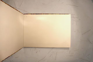
As well as the practical integration I also wanted to create a nostalgic feeling through the lighting and tone. I imagined Dwayne would be looking through this book in the corner of his room under soft lamplight. It is a treasured book, an heirloom.

I attempted to achieve this look through a combination of blending modes and shadow maps on the digital pages. On moving into after effects I experimented with the match grain effect, the tint and the fast blur effect. Through a combination of these effects the digital assets began to feel grounded with the live action.


Tuesday 9 January 2018

Final scene layout


One of the decisions we came to as a group was to create the final scene entirely in cut out with minimal digital elements. Emotionally and aesthetically this felt like a strong tone to end on. Stop motion animation of Dwayne's real paper hands picking up a real image of his daughter and it being placed on a real background depicting a wall of pictures in his new home. It felt more authentic to portray this in a tangible way. I used the wallpaper from the autumn scene internal frame and cut a series of frames to overall depict a house silhouette which would transition into the Peter McVerry Trust house logo. I added a small oval frame above the door with a photo of the key from the front of the album. The images in the other frames are the only digital element in the scene.

Monday 8 January 2018

Book footage background

It was important to choose a neutral background which wouldn't distract from the action taking place in the book. So white was the natural choice but it was also important to retain a sense of connection stylistically with the rest of the look of the elements. So I chose one of the patterned papers we had found. I feel that this supports the action while also bearing a good relationship with an underlying nature theme that has emerged due to the elegant fibres in the paper.

In order to maintain the lighting from the book footage I used a difference blending option on a light blue layer over the background. I then placed an image of the scanned textured paper over that in a dependent layer.